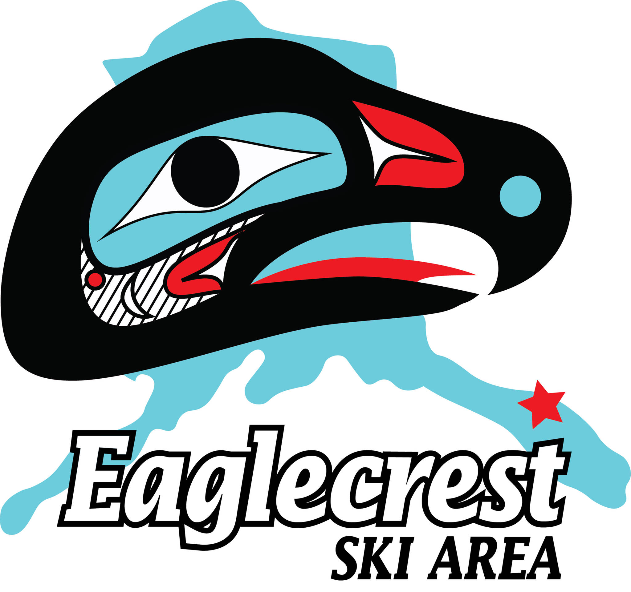
Eaglecrest Ski Area turned back the clock in coming up with its new logo.
The ski area revealed on social media last month it would be swapping out its logo with an “old friend,” a revised version of Eaglecrest’s original logo from 1976.
Gone is the orange bald eagle and mountain range set against a blue and black backdrop. Taking its place is a red, teal and black eagle head overlapping a cutout of Alaska.
“I think with the new logo, it represents the original Eaglecrest when it was first formed, all that community passion behind it,” Erin Lupro, Eaglecrest’s Director of Snowsports School, Rental, Repair and Retail, said.
Lupro said the old logo was originally going to be saved for the ski area’s 50th anniversary season. However, she said the staff liked it so much they wanted to bring it back sooner.
Lupro, who started working on the project last summer, said she couldn’t find who created the old logo. In an effort to make sure it would still be culturally appropriate to use, Eaglecrest consulted with Sealaska Heritage Institute President Rosita Worl.
Worl told the ski area the design would not be considered cultural appropriation.
“SHI’s policy seeks protection of clan crest designs and restricts others but the clan from using them, but the policy allows for public, general use of generic formline design,” she said in an email to the Empire.
Worl said she proposed that SHI artist Donald Gregory improve the design’s formline elements.
“Donald has studied with master artists, and he knows and understands formline,” Worl said.
Lupro said the mountain has gone through about five different logos. The new design will appear on everything including promotional material, rental shop equipment and sweatshirts starting next season.
• Contact sports reporter Nolin Ainsworth at 523-2272 or nainsworth@juneauempire.com. Follow Empire Sports on Twitter at @akempiresports.

